Plotting Flow Cytometry Data
This tutorial focuses on how to plot flow cytometry data using FlowCal, particularly by using the module FlowCal.plot
To start, navigate to the examples directory included with FlowCal, and open a python session therein. Then, import FlowCal as with any other python module.
>>> import FlowCal
Also, import numpy and pyplot from matplotlib
>>> import numpy as np
>>> import matplotlib.pyplot as plt
Histograms
Let’s load the data from file sample006.fcs into an FCSData object called s, and tranform all channels to arbitrary units.
>>> s = FlowCal.io.FCSData('FCFiles/sample006.fcs')
>>> s = FlowCal.transform.to_rfi(s)
One is often interested in the fluorescence distribution across a population of cells. This is represented in a histogram. Since FCSData is a numpy array, one could use the standard hist function included in matplotlib. Alternatively, FlowCal includes its own histogram function specifically tailored to work with FCSData objects. For example, one can plot the contents of the FL1 channel with a single call to FlowCal.plot.hist1d().
>>> FlowCal.plot.hist1d(s, channel='FL1')
>>> plt.show()
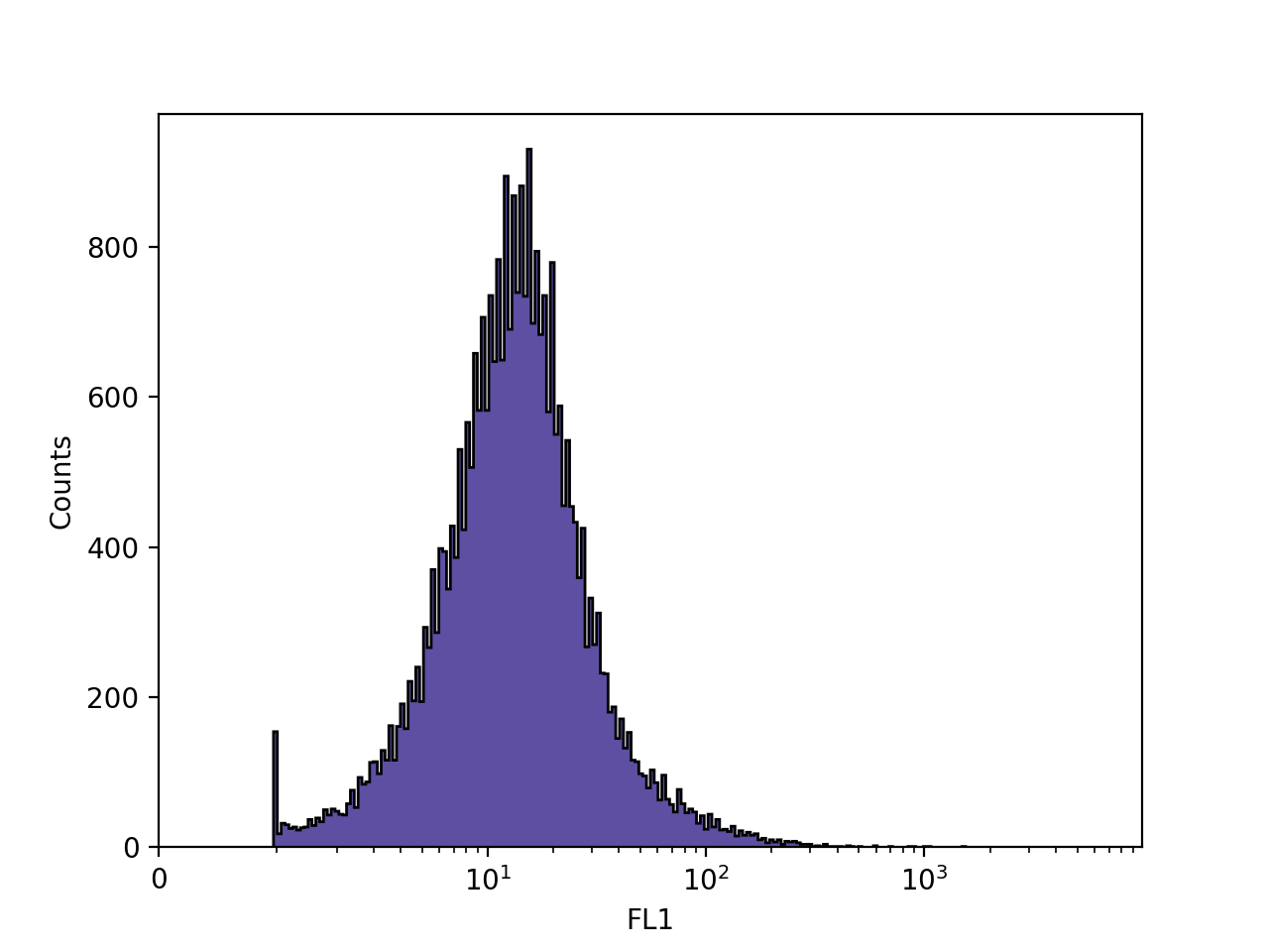
FlowCal.plot.hist1d() behaves mostly like a regular matplotlib plotting function: it will plot in the current figure and axis. The axes labels are populated by default, but one can still use plt.xlabel and plt.ylabel to change them.
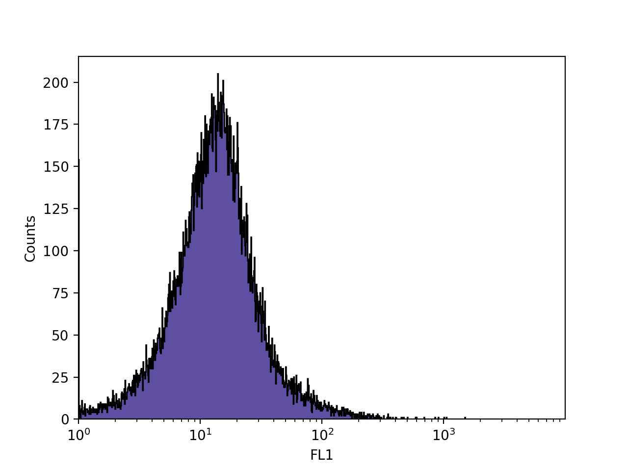
By default, FlowCal.plot.hist1d() uses something called logicle scaling for the x axis. This scaling allows visualization of high fluorescence values with logarithmic spacing, and low fluorescence values with a more linear spacing. In some modern flow cytometers, negative events may be present, and logicle scaling allows visualization of those as well. This can be changed to a more conventional linear or logarithmic scale by using the xscale argument. In addition, FlowCal.plot.hist1d() uses 256 uniformly spaced bins by default. We can override the default bins using the bins argument. Let’s try using 1024 logarithmically-spaced bins.
>>> FlowCal.plot.hist1d(s, channel='FL1', xscale='log', bins=1024)
>>> plt.show()
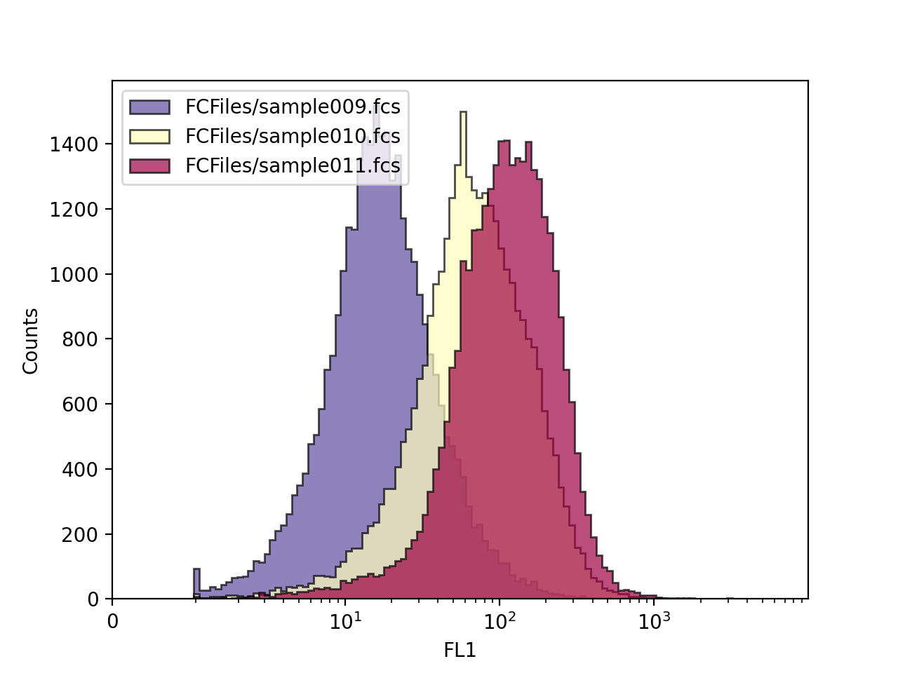
Finally, FlowCal.plot.hist1d() can plot several FCSData objects at the same time. Let’s now load 3 FCSData objects, transform all channels to a.u., and plot the FL1 channel of all three with transparency.
>>> filenames = ['FCFiles/sample{:03d}.fcs'.format(i + 9) for i in range(3)]
>>> d = [FlowCal.io.FCSData(filename) for filename in filenames]
>>> d = [FlowCal.transform.to_rfi(di) for di in d]
>>> FlowCal.plot.hist1d(d, channel='FL1', alpha=0.7, bins=128)
>>> plt.legend(filenames, loc='upper left')
>>> plt.show()
Density Plots
It is also common to look at the forward scatter and side scatter values in a 2D histogram, scatter plot, or density diagram. From those, the user can extract size and shape information that would allow him to differentiate between cells and debris. FlowCal includes the function FlowCal.plot.density2d() for this purpose.
Let’s look at the FSC and SSC channels in our sample s.
>>> FlowCal.plot.density2d(s, channels=['FSC', 'SSC'])
>>> plt.show()
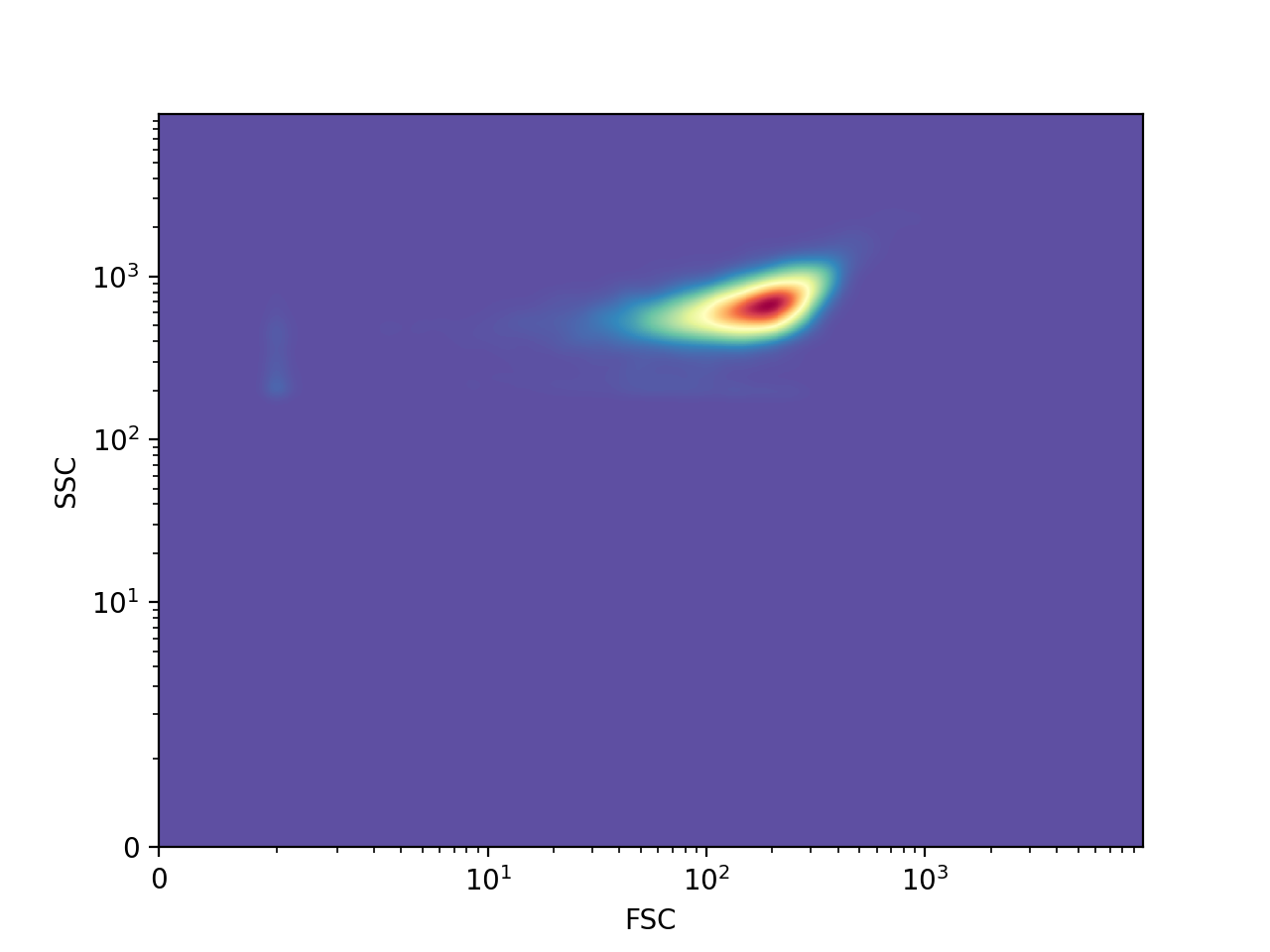
The color indicates the number of events in the region, with red indicating a bigger number than yellow and blue, in that order, by default. Similarly to FlowCal.plot.hist1d(), FlowCal.plot.density2d() uses logicle scaling by default. In addition, FlowCal.plot.density2d() applies, by default, gaussian smoothing to the density plot.
FlowCal.plot.density2d() includes two visualization modes: mesh (seen above), and scatter. The last one is good for distinguishing regions with few events.
>>> FlowCal.plot.density2d(s, channels=['FSC', 'SSC'], mode='scatter')
>>> plt.show()
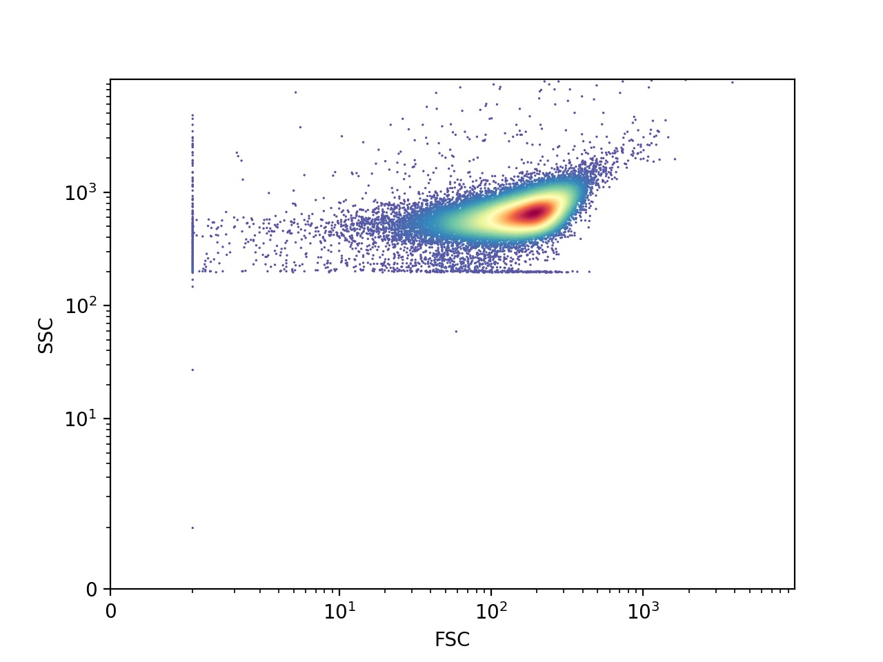
The last plot shows three distinct populations. The large one in the middle corresponds to cells, whereas the ones at the left and below correspond to non-biological debris. We will see how to “gate”, or select only one population, in the gating tutorial.
Combined Histogram and Density Plots
FlowCal also includes “complex plot” functions, which produce their own figure and a set of axes, and use simple matplotlib or FlowCal plotting functions to populate them.
In particular, FlowCal.plot.density_and_hist() uses FlowCal.plot.hist1d() and FlowCal.plot.density2d() to produce a combined density plot/histogram that allow the user to quickly see information about one sample. For example, let’s plot the FSC and SSC channels in a density plot, and the FL1 channel in a histogram. In the following, density_params and hist_params are dictionaries that are directly passed to FlowCal.plot.hist1d() and FlowCal.plot.density2d() as keyword arguments.
>>> FlowCal.plot.density_and_hist(s,
...                               density_channels=['FSC', 'SSC'],
...                               density_params={'mode':'scatter'},
...                               hist_channels=['FL1'])
>>> plt.tight_layout()
>>> plt.show()
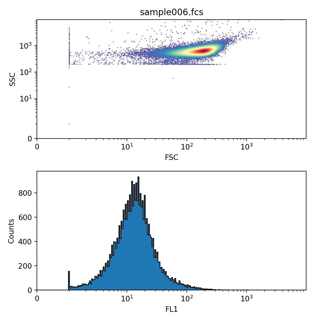
FlowCal.plot.density_and_hist() can also plot data before and after applying gates. We will see this in the gating tutorial.
Violin Plots
Histograms, as shown above, can be used to plot and compare data from multiple samples. However, they can easily get too crowded. A more compact way is to use a violin plot, wherein vertical, normalized, symmetrical histograms (“violins”) are shown centered on corresponding x-axis values. We can do this with the FlowCal.plot.violin() function.
>>> filenames = ['FCFiles/sample{:03d}.fcs'.format(i+6) for i in range(10)]
>>> d = [FlowCal.io.FCSData(filename) for filename in filenames]
>>> d = [FlowCal.transform.to_rfi(di) for di in d]
>>> dapg = np.array([0, 2.33, 4.36, 8.16, 15.3, 28.6, 53.5, 100, 187, 350])
>>> FlowCal.plot.violin(data=d, channel='FL1', positions=dapg, xlabel='DAPG (uM)', xscale='log', ylim=(1e0,2e3))
>>> plt.show()
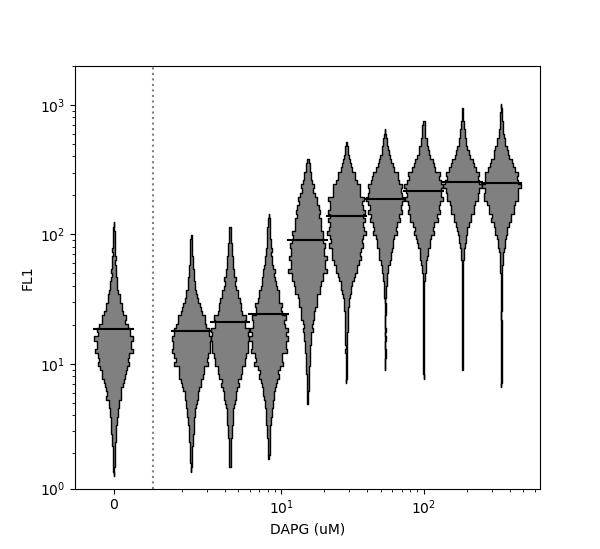
Note that the x axis has been plotted on a logarithmic scale using the xscale argument. Because data at position x=0 is specified, FlowCal.plot.violin() places it separately on the left side of the plot. In contrast, the y-axis is plotted on a logicle scale by default. However, it can be switched to log or linear using the argument yscale. Horizontal violin plots can also be generated by setting the vert argument to False. For more options, consult the function documentation.
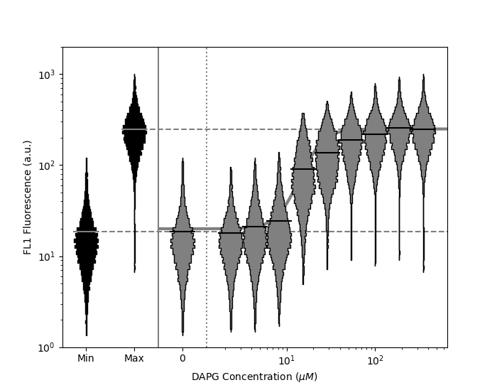
“Dose response” or “transfer” functions are common in biology. These sometimes include minimum (negative) and maximum (positive) controls, and are often approximated by mathematical models. The FlowCal.plot.violin_dose_response() function can be used to plot a full dose response dataset, including min data, max data, and a mathematical model. Min and max data are illustrated to the left of the plot, and the mathematical model is correctly illustrated even when a position=0 violin is illustrated separately when xscale is log.
>>> # Function specifying mathematical model
>>> def dapg_sensor_model(dapg_concentration):
>>>     mn = 20
>>>     mx = 250.
>>>     K  = 20.
>>>     n  = 3.57
>>>     if dapg_concentration <= 0:
>>>         return mn
>>>     else:
>>>         return mn + ((mx-mn)/(1+((K/dapg_concentration)**n)))
>>>
>>> # Plot
>>> FlowCal.plot.violin_dose_response(
>>>     data=d,
>>>     channel='FL1',
>>>     positions=dapg,
>>>     min_data=d[0],
>>>     max_data=d[-1],
>>>     model_fxn=dapg_sensor_model,
>>>     xscale='log',
>>>     yscale='log',
>>>     ylim=(1e0,2e3),
>>>     draw_model_kwargs={'color':'gray',
>>>                        'linewidth':3,
>>>                        'zorder':-1,
>>>                        'solid_capstyle':'butt'})
>>> plt.xlabel('DAPG Concentration ($\mu M$)')
>>> plt.ylabel('FL1 Fluorescence (a.u.)')
>>> plt.show()
Other Plotting Functions
These are not the only functions in FlowCal.plot. For more information, consult the API reference.